The colors you choose for your home aren’t just about style—they can deeply influence your mood, behavior, and even your productivity. In fact, color psychology is a fascinating field that explores how specific hues impact emotions and mental states. Whether you’re designing a serene bedroom, a lively living room, or a focused workspace, understanding color psychology can help you create an environment that fosters the right feelings and energy.
At Scale & Structure, we specialize in helping homeowners choose the perfect colors for their spaces to enhance both aesthetics and mood. In this blog, we’ll explore the power of color and how to select the best hues for your home.
What is Color Psychology?
Color psychology is the study of how colors affect human emotions and behaviors. Different colors can invoke various feelings and reactions, making them a powerful tool in interior design. The right color scheme can boost productivity, create a sense of calm, inspire creativity, or even help with relaxation. Understanding how different colors work in a space allows you to use them intentionally to create the desired atmosphere.
The Psychological Impact of Colors
1. Red: Energy and Passion
Red is a bold and vibrant color associated with energy, passion, and excitement. It’s a stimulating color that can increase heart rates and promote physical energy. While red is excellent for creating a dynamic and passionate atmosphere, it’s important to use it in moderation.
- Best for: Living rooms, dining rooms, and accent walls.
- Avoid in: Bedrooms or places where relaxation is key (it might be too stimulating for sleep).
Red can also increase appetite, making it a popular choice in kitchens and dining rooms.
2. Blue: Calm and Focus
Blue is widely regarded for its calming and peaceful effects. It has a soothing quality that helps reduce stress and anxiety. It’s also linked to clear thinking and focus, making it a great choice for areas where concentration is needed, like home offices or reading rooms.
- Best for: Bedrooms, bathrooms, and offices.
- Avoid in: Spaces where creativity and energy are key, as too much blue can be too calming or even cause sadness.
Light blue shades are particularly effective at creating a serene atmosphere, while deeper blues can bring a sense of luxury and sophistication to the space.
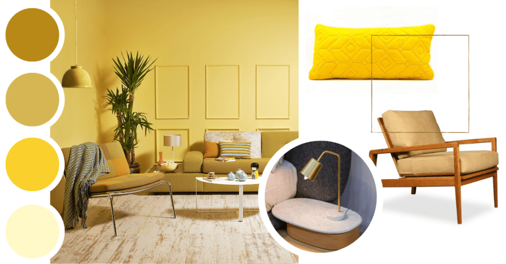
3. Yellow: Optimism and Creativity
Yellow is often associated with sunshine, warmth, and positivity. It’s a color that stimulates creativity and communication, making it an excellent choice for spaces where people gather to share ideas or socialize. Yellow also has a natural ability to brighten a room and improve mood.
- Best for: Kitchens, home offices, and creative spaces.
- Avoid in: Bedrooms or other areas where restfulness is required (yellow can be too stimulating).
Bright yellow can be overwhelming in large quantities, so it’s best to use it as an accent color. Softer, buttery yellows can create a cheerful and welcoming atmosphere without feeling too intense.
4. Green: Balance and Renewal
Green is the color of nature, often associated with balance, harmony, and renewal. It has a calming effect on the mind and body, making it a great choice for spaces where relaxation and rejuvenation are key. Green also symbolizes growth and health, which can inspire feelings of well-being.
- Best for: Bedrooms, living rooms, and bathrooms.
- Avoid in: Highly energetic spaces like kitchens (where red or yellow might be more suitable).
From deep forest greens to lighter sage tones, green can be used to create a natural, tranquil environment or add a touch of luxury to a room.
5. Purple: Luxury and Creativity
Purple is often associated with luxury, creativity, and sophistication. This rich and bold color can inspire imagination and stimulate creativity, making it a great choice for spaces where inspiration is needed, such as art studios or home offices.
- Best for: Creative spaces, bedrooms, or areas where you want to feel inspired.
- Avoid in: Rooms that require a more energetic or calming atmosphere, as purple can be a bit too stimulating.
Lavender and lighter purple hues can add a touch of elegance without overwhelming the space, while deeper purples lend an air of luxury and mystique.
6. Orange: Enthusiasm and Warmth
Orange is an energizing and warm color that brings feelings of enthusiasm and excitement. It’s less intense than red but still promotes a sense of action and adventure. Orange is great for social spaces where you want to encourage conversation and interaction.
- Best for: Living rooms, dining rooms, and game rooms.
- Avoid in: Bedrooms or spaces where relaxation is the goal.
A balance of orange can create a welcoming environment, but like yellow, it’s best used as an accent or feature color to avoid overwhelming the room.
7. Neutral Colors: Stability and Calm
Neutral colors like beige, gray, and white are timeless and versatile. They create a calm, stable atmosphere and provide a great backdrop for other, more vibrant colors. Neutral tones can make a space feel larger, more open, and sophisticated, allowing other design elements to take center stage.
- Best for: Any room in the house, especially when you want a serene, minimalist aesthetic.
- Avoid in: Overuse of neutrals can make a space feel cold and impersonal.
Neutrals also pair well with virtually any color, giving you the freedom to experiment with accent hues in furniture or decor.
How to Use Color Psychology in Your Home
1. Consider the Function of Each Room
When choosing colors, think about the function of the space and the emotions you want to evoke. For example, a bedroom should promote relaxation and restfulness, so calming colors like blue or green are ideal. On the other hand, a kitchen might benefit from the energetic and appetite-boosting qualities of yellow or red.
2. Pair Colors for Balance
You don’t have to commit to one color—mixing hues thoughtfully can create balance and harmony in your space. Pair calming colors like blue or green with neutrals like beige or gray for a balanced look. If you want to add energy, introduce accents of bold colors like yellow or orange.
3. Consider Lighting
The lighting in a room can significantly affect how colors appear. Natural light tends to bring out the best in colors, making them appear brighter and more vibrant. On the other hand, artificial lighting can change how colors look, especially in the evenings. Always test colors in the room where they will be used before making your final decision.
4. Use Color to Define Zones
In open-concept spaces or larger rooms, color can help define different zones within the space. For example, you might use a warm, energizing color like red for the dining area, while using a more calming color like blue for the living area. This creates a flow while maintaining distinct moods in each part of the room.
Color Psychology and Scale & Structure
At Scale & Structure, we understand the powerful impact that color can have on your home’s ambiance. Our team of interior design experts can help you choose the perfect colors that align with your lifestyle, personality, and the mood you want to create in your home. Whether you’re looking for a peaceful sanctuary or an energetic space to entertain, we can design a space that enhances both form and function.
Why Choose Scale & Structure?
- Personalized Color Consultations: We work with you to select the best colors for each room, creating an environment that supports your lifestyle and enhances your well-being.
- Expert Guidance: Our team of interior designers has the expertise to balance color psychology with aesthetic appeal, ensuring your space looks beautiful and feels great.
- Sustainable Design: We use eco-friendly paints and materials, aligning with your values while designing spaces that are healthy and sustainable.
Ready to transform your home with color? Contact Scale & Structure today for a consultation, and let’s bring the perfect hues into your space.