Color plays a crucial role in interior design, as it influences mood, emotions, and overall well-being. By understanding color psychology, you can make more informed choices about the colors you use in your home. Each color has its own unique set of psychological effects, and when applied thoughtfully, it can transform your space and elevate the atmosphere. Here’s a guide on how to choose the right colors for your space based on color psychology principles.
1. The Power of Colors in Interior Design
Colors are more than just aesthetic choices; they evoke emotions and can even impact productivity and relaxation. Understanding the psychological effects of different colors helps you create spaces that suit specific functions, whether it’s to promote relaxation, stimulate creativity, or encourage social interaction.
2. Warm Colors: Energizing and Inviting
Warm colors like red, orange, and yellow are often associated with warmth, energy, and excitement. These colors can add a sense of vibrancy to your home, making them ideal for social areas like living rooms, kitchens, and dining rooms.
- Red: Known for stimulating energy and excitement, red is a bold and passionate color. It can increase heart rate and stimulate conversation, making it ideal for dining rooms and living areas where socializing happens. However, too much red can feel overwhelming, so it’s best used in accent walls or décor.
- Orange: Orange is a friendly and energetic color that promotes creativity and enthusiasm. It works well in spaces where you want to encourage interaction and fun, such as a playroom, entertainment space, or home office.
- Yellow: Yellow is associated with happiness, optimism, and mental clarity. It can bring warmth and brightness to a space, especially in areas like kitchens, breakfast nooks, and home offices. However, it’s best to use softer shades of yellow, as too much bright yellow can lead to overstimulation.
3. Cool Colors: Calm and Relaxing
Cool colors such as blue, green, and purple are often linked to calmness, relaxation, and tranquility. These colors are ideal for spaces where you want to unwind and de-stress, such as bedrooms, bathrooms, and meditation rooms.
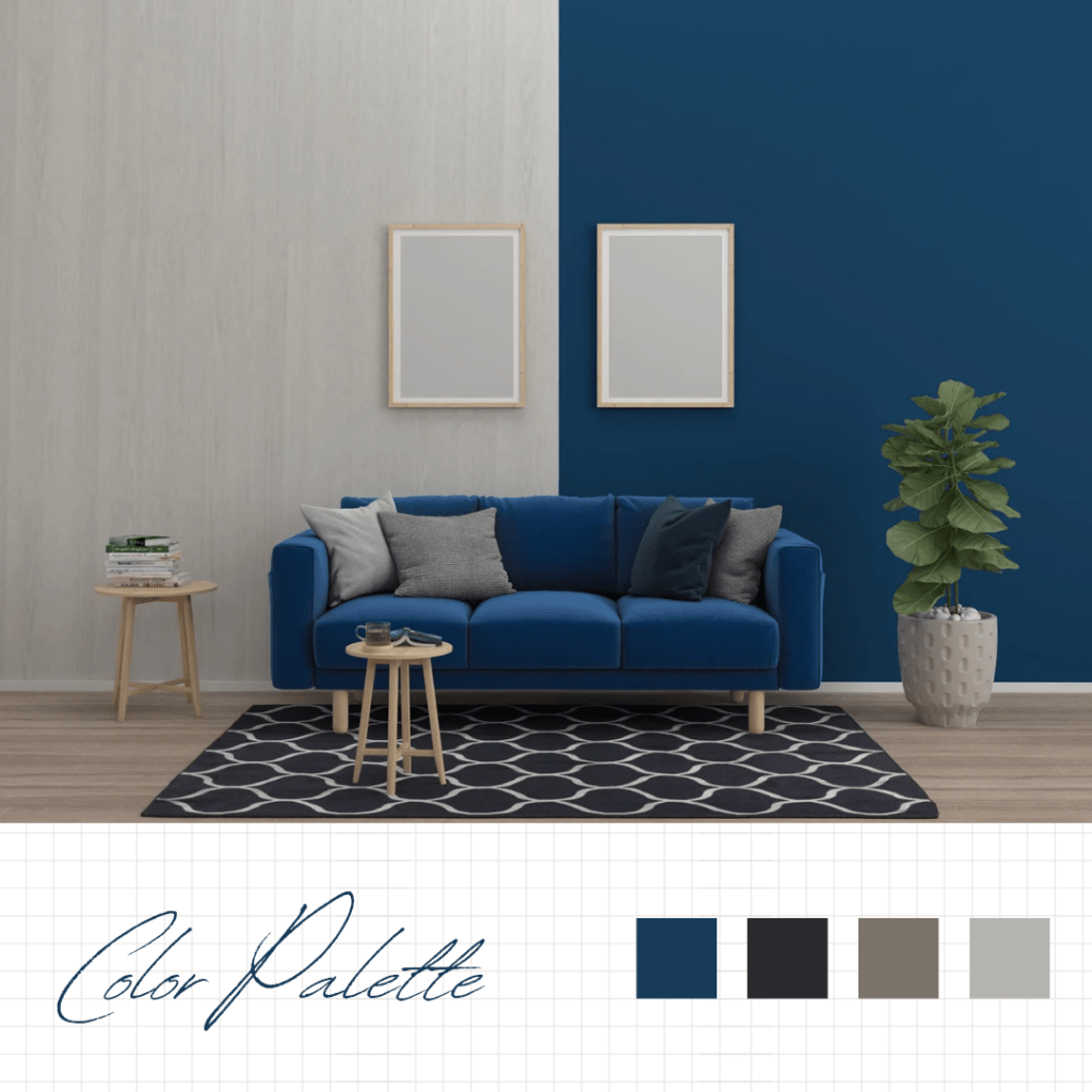
- Blue: Blue is considered a calming color that promotes relaxation and tranquility. It’s ideal for bedrooms or any space where you want to create a peaceful, serene atmosphere. Lighter blues are soothing, while deeper blues evoke a sense of stability and trust.
- Green: Green is associated with nature, growth, and harmony. It brings a sense of balance and relaxation, making it a perfect choice for living rooms, offices, and bedrooms. Different shades of green can evoke different feelings—lighter greens promote a refreshing, restful feel, while darker greens feel more luxurious and grounded.
- Purple: Purple is often considered a royal or spiritual color, with a calming effect on the mind. Lighter shades like lavender promote relaxation, while deeper purples like aubergine create a sense of luxury and sophistication. Purple can be used in bedrooms or living rooms to add a touch of elegance and creativity.
4. Neutral Colors: Timeless and Versatile
Neutral colors such as white, gray, beige, and brown provide a timeless, versatile foundation for any interior. These colors can be used alone or paired with accent colors to create different moods and enhance the overall aesthetic.
- White: White symbolizes purity, cleanliness, and simplicity. It can make a space feel larger, brighter, and more open, making it ideal for smaller rooms. However, too much white can feel cold or sterile, so it’s often paired with warmer accents or textures.
- Gray: Gray is a sophisticated, neutral color that adds depth and balance to a room. Lighter grays can create a soft, calming effect, while darker grays add a sense of drama and elegance. Gray works well in almost any room and pairs nicely with both warm and cool accent colors.
- Beige: Beige is a warm and neutral color that creates a welcoming, comfortable atmosphere. It works well in living rooms, bedrooms, and entryways. Beige can be a great backdrop for bold accent colors and helps maintain a balanced and harmonious interior.
- Brown: Brown is earthy and grounding, providing a sense of stability and warmth. It’s a great choice for rustic or natural-themed interiors and can add richness and texture to a room when used for furniture or accent pieces.
5. Accent Colors: Adding Personality and Style
Accent colors can be used strategically to enhance the mood of a room and add personality. These colors should complement the primary color scheme and help highlight certain features of the space.
- Metallics: Gold, silver, and copper accents can add a touch of luxury and elegance to any room. These metallic shades work well in living rooms, dining areas, or bathrooms to create a sophisticated, glamorous feel.
- Bold Colors: If you want to add a burst of energy to a room, consider using bold colors like bright pink, teal, or turquoise as accents. These vibrant colors can be introduced through pillows, artwork, rugs, or furniture. Use them sparingly to avoid overwhelming the space.
6. Consider Room Functionality
When selecting colors, consider the function of the room and how you want to feel in that space.
- Living Room: This is a social space where you want a welcoming, vibrant environment. Warm colors like red and orange can encourage conversation, while cool tones like blue and green can create a relaxing atmosphere.
- Bedroom: The bedroom should feel calm and restful. Opt for cool colors like soft blues, greens, or lavender to promote relaxation and sleep. You can also use neutrals like beige and gray to create a tranquil and peaceful environment.
- Home Office: The home office should be a space that boosts productivity and creativity. Colors like light blue and green can increase focus and concentration, while brighter hues like yellow or orange can stimulate creativity and energy.
- Kitchen and Dining Room: In kitchens and dining rooms, colors like yellow, red, and orange stimulate appetite and energy. These warm colors can make the space feel inviting, while neutrals like beige or gray can create a more subdued, calm atmosphere for mealtime.
7. Consider Natural Light and Room Size
The amount of natural light and the size of a room will also impact how colors appear. Lighter colors like whites, creams, and pastels reflect light and make a room feel larger and brighter, making them ideal for smaller or darker spaces. On the other hand, darker colors can create a cozy, intimate atmosphere, but they may make a room feel smaller, so they are better suited for larger, well-lit rooms.
8. Creating Harmony with Color Schemes
To create a harmonious and cohesive design, it’s important to select a color scheme that flows throughout your home. Some popular color schemes include:
- Monochromatic: Using variations of a single color creates a cohesive, calming look.
- Complementary: Pairing colors from opposite sides of the color wheel, such as blue and orange or red and green, creates vibrant, energetic contrasts.
- Analogous: Combining colors that are next to each other on the color wheel, like blue, blue-green, and green, results in a harmonious, tranquil effect.