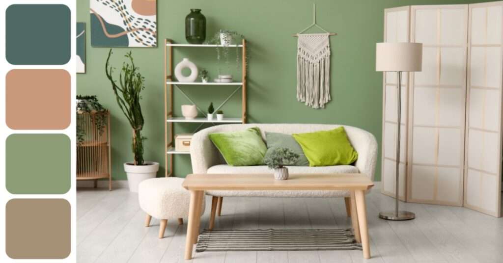
When we think of nature in interior design, greens and browns often take the spotlight. While these earthy tones are undeniably calming and grounding, the natural world offers a much broader and richer spectrum of colors. From the soft pastels of spring flowers to the bold hues of sunsets and the moody blues of deep waters, nature is full of inspiration waiting to be explored. By tapping into these often-overlooked palettes, you can create interiors that feel fresh, soulful, and deeply connected to the environment.
Ocean-Inspired Blues and Seafoam Shades
The ocean provides a soothing blend of deep navy, teal, aqua, and seafoam green. These cool tones evoke tranquility and spaciousness, making them perfect for bedrooms, bathrooms, or any area meant for relaxation. Layering different shades of blue—like stormy grays, coastal turquoise, and frothy white—mimics the ocean’s depth and movement. Incorporating natural textures like driftwood, linen, and rattan enhances the coastal feel without relying on typical beachy clichés.
Desert Neutrals and Sun-Baked Tones
Inspired by the quiet beauty of arid landscapes, desert palettes go far beyond beige. Think sandy taupes, terracotta, clay pinks, sun-bleached peach, and golden ochres. These warm, muted hues bring a grounded yet modern feel to interiors. Paired with textured materials like raw wood, suede, and stone, these colors create cozy and earthy environments. They work beautifully in living rooms and kitchens, offering both sophistication and comfort.
Floral Hues: Lavender, Rose, and Marigold
Flowers bring an array of colors that are bold, joyful, and elegant. Soft lavender and lilac shades bring a dreamy calmness, perfect for bedrooms or meditative spaces. Dusty rose and blush tones add warmth and romance without overpowering. For a bolder touch, marigold or sunflower yellow injects happiness and energy into any room. Using floral-inspired tones in upholstery, wallpaper, or accent walls adds color without compromising on sophistication.
Mountain and Forest Moods
Moving beyond forest green, the colors of mountainous terrain and alpine forests include charcoal gray, misty silver, icy blue, and deep pine. These colors evoke solitude, strength, and serenity. Use them to create a cool, calming atmosphere in office spaces, bathrooms, or modern minimalist homes. Accent with matte black, raw concrete, or brushed steel for a moody yet elegant contrast.
Sunset and Sunrise Palettes
Nature’s most breathtaking moments often happen in the sky. Sunsets and sunrises provide a gradient of colors that range from fiery orange to soft coral, dusty pink, lavender, and golden yellow. These warm and uplifting shades can bring vibrancy to social spaces like dining rooms and lounges. Soft gradients painted on walls or incorporated through fabrics and art can mimic this effect beautifully without overwhelming the space.
Earth and Mineral Tones
From volcanic black to copper red and slate gray, the mineral world offers bold yet refined colors. These tones, drawn from rock formations, volcanic soil, and metallic veins, work well in industrial or contemporary interiors. They lend a strong, grounded feel and pair excellently with polished concrete, dark woods, or glass. Deep rusts, charcoal, and even subtle metallic finishes can add dramatic flair while still staying true to nature.
Botanical and Fruit-Inspired Colors
Think beyond green when exploring plant-based inspiration. Nature gives us the jewel tones of berries, the richness of fig or plum, and the brightness of citrus. Deep berry tones bring drama and depth, while citrus shades like tangerine or lemon yellow add zest and playfulness. These colors work especially well as accent pieces, creating dynamic focal points in otherwise neutral rooms.
Incorporating Nature’s Palette Mindfully
When applying nature-inspired palettes, balance is key. Consider using bold tones as accents while keeping the larger surfaces neutral. Let natural light influence your color choices—cool hues thrive in well-lit rooms, while warm tones can make darker areas feel cozy. Texture, finish, and materials all play a role in how a color is perceived. Pairing these palettes with organic materials like stone, wood, linen, and wool will amplify their natural origin.